Student Minds
Branding/Campaign
Brief:
to re-brand the mental health charity, “Student Minds” by updating the logo with a follow-up campaign.
Solution:
The main rounded shape encapsulates three different symbols. The first being a brain in association with the idea of ‘minds’. The second is a thought bubble aiming to represent the point of speaking to the charity. The final symbol is ‘therapy stones’ representing emotions.
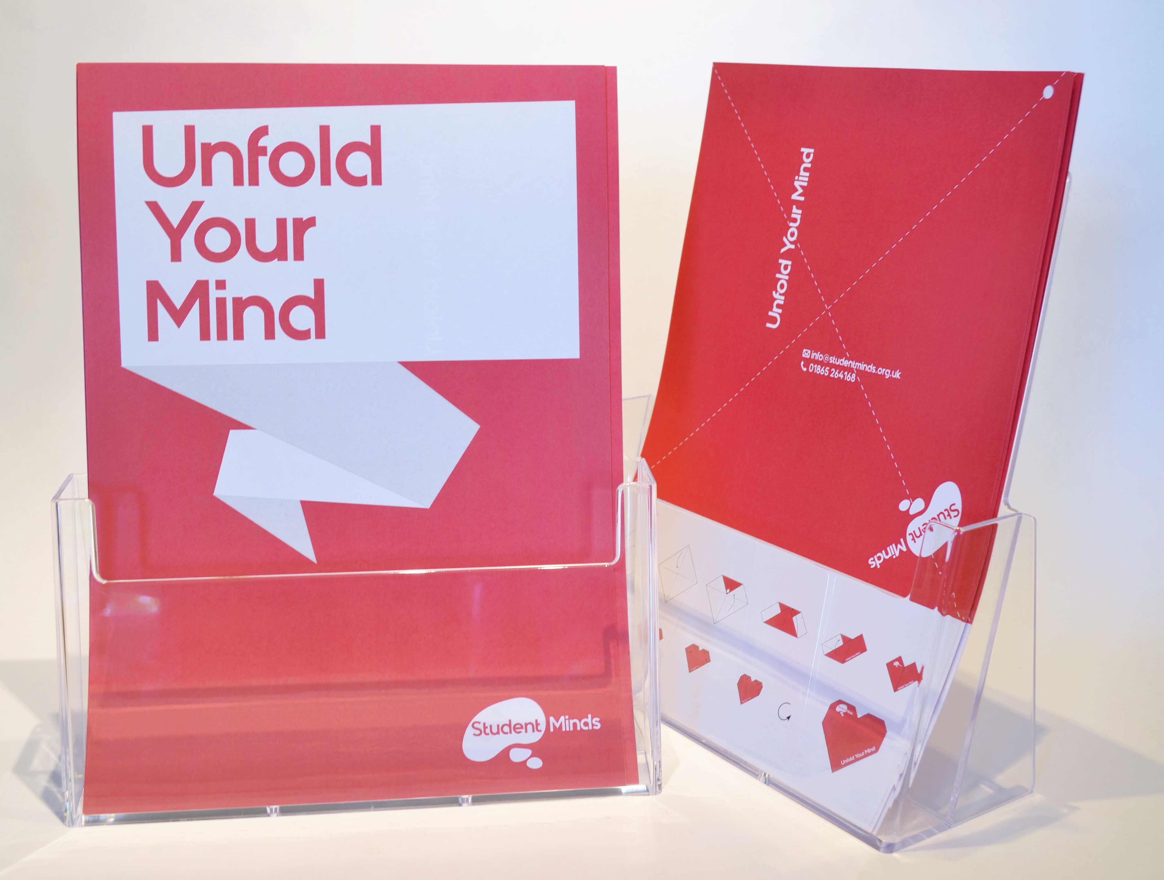
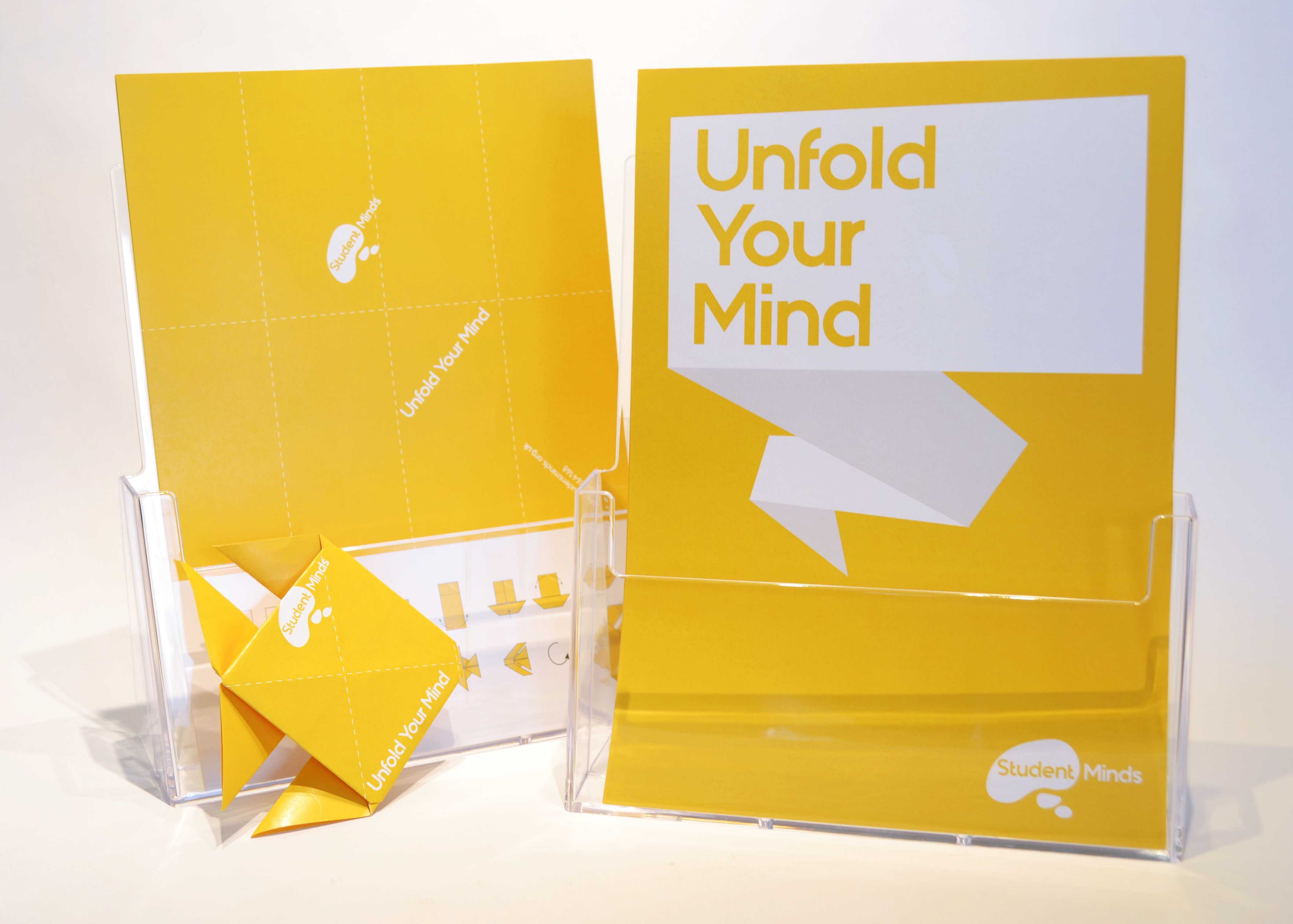
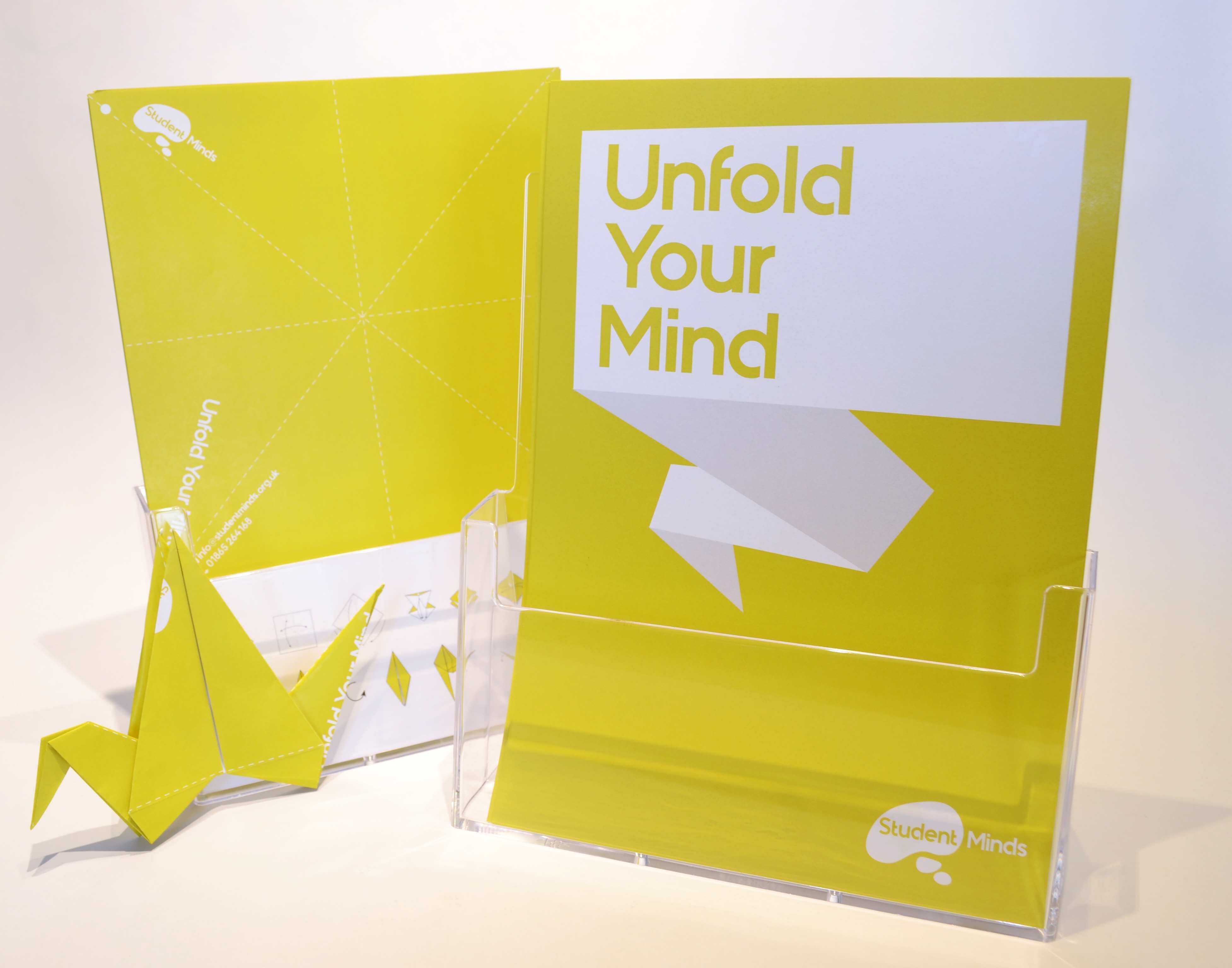
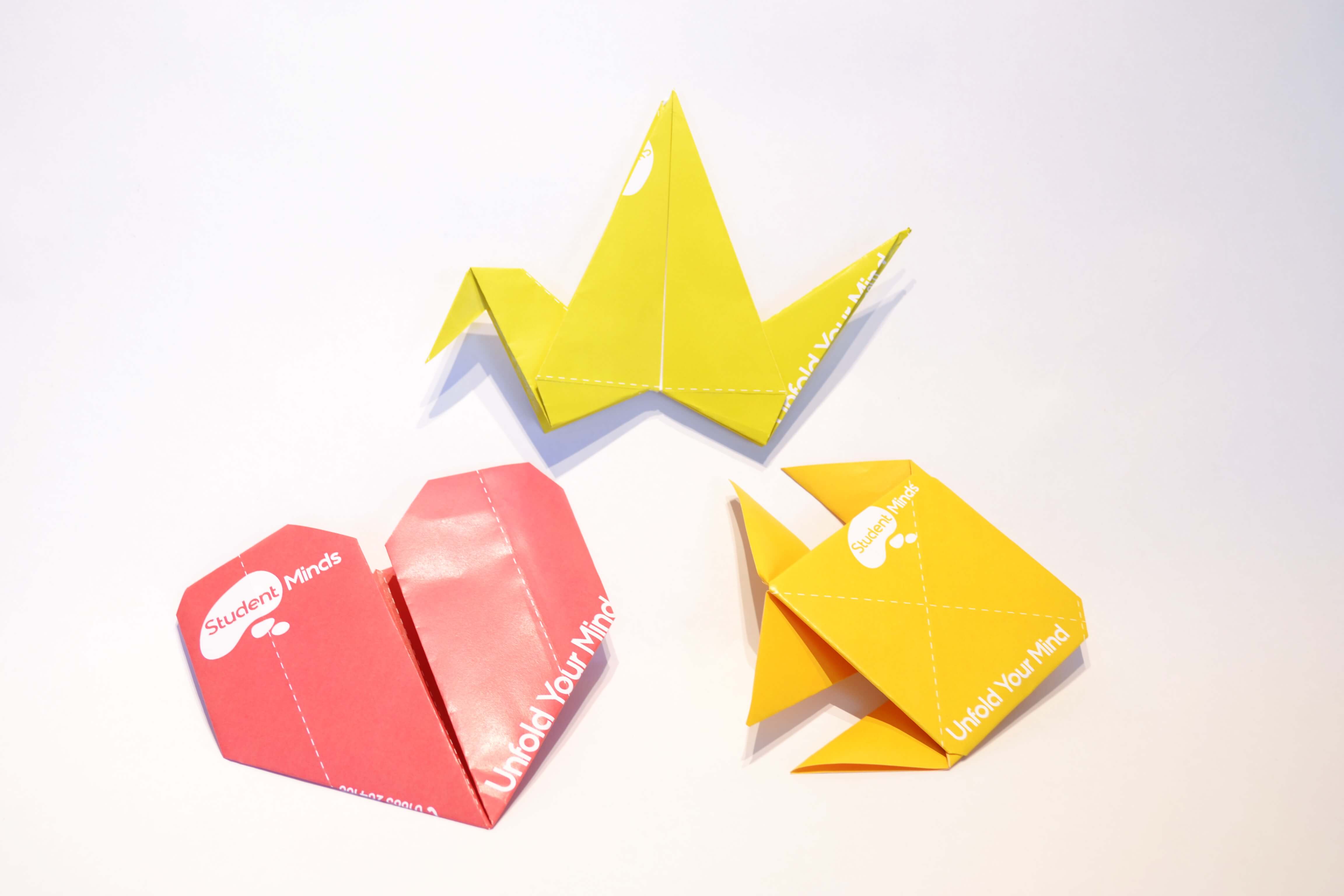
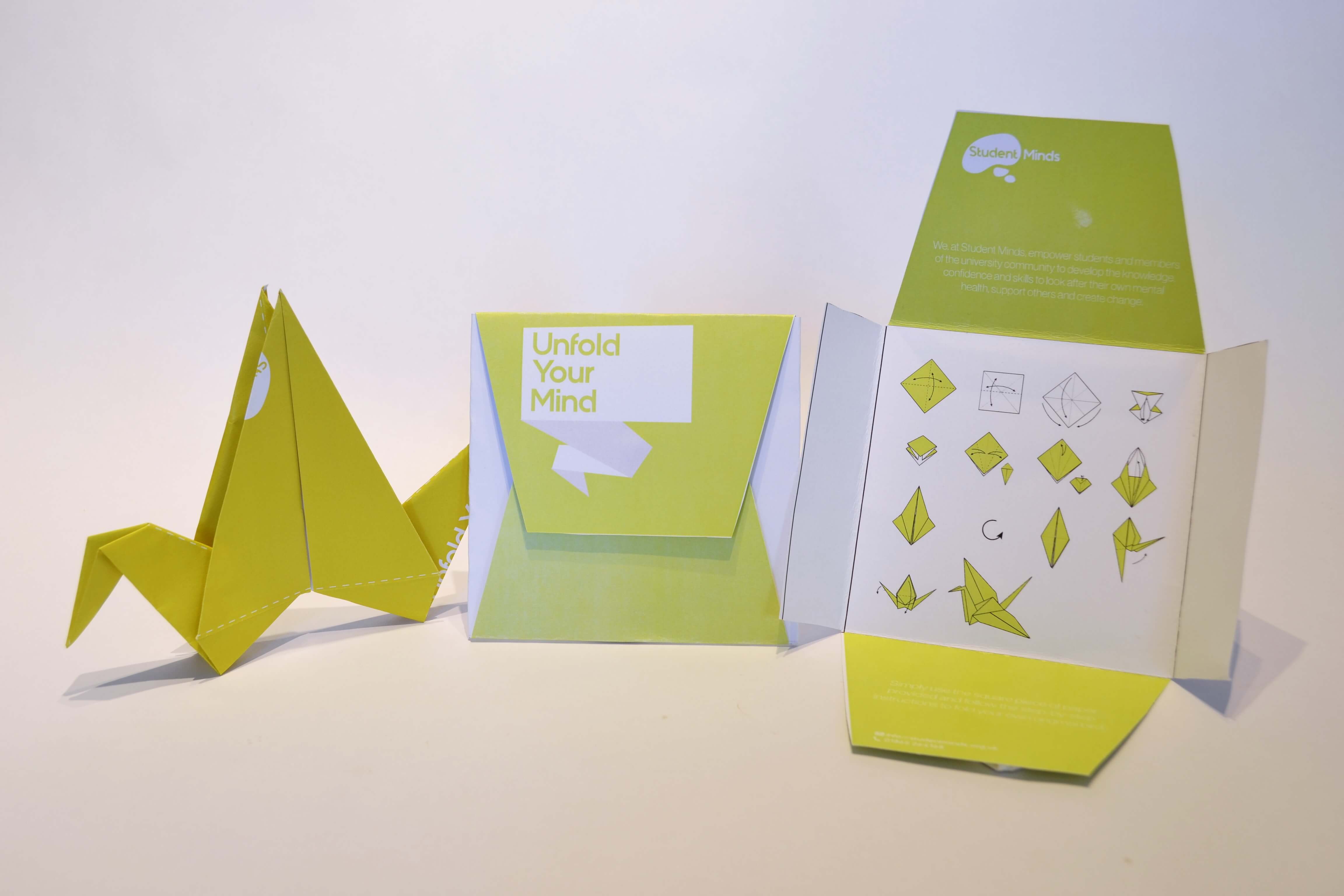
The poster’s speech bubble relates to the Student Mind’s aim to get students to speak up. Then, with the idea of creative therapy in mind, the origami aims to represent unfolding your mind whilst providing a relaxing and creative form of therapy.
