Grand Cafe
Branding/Packaging
Brief:
to visually re-think and revitalise the brand, creating designs that will not only communicate what great coffee Grand Café is but also the good that it does.
Solution:
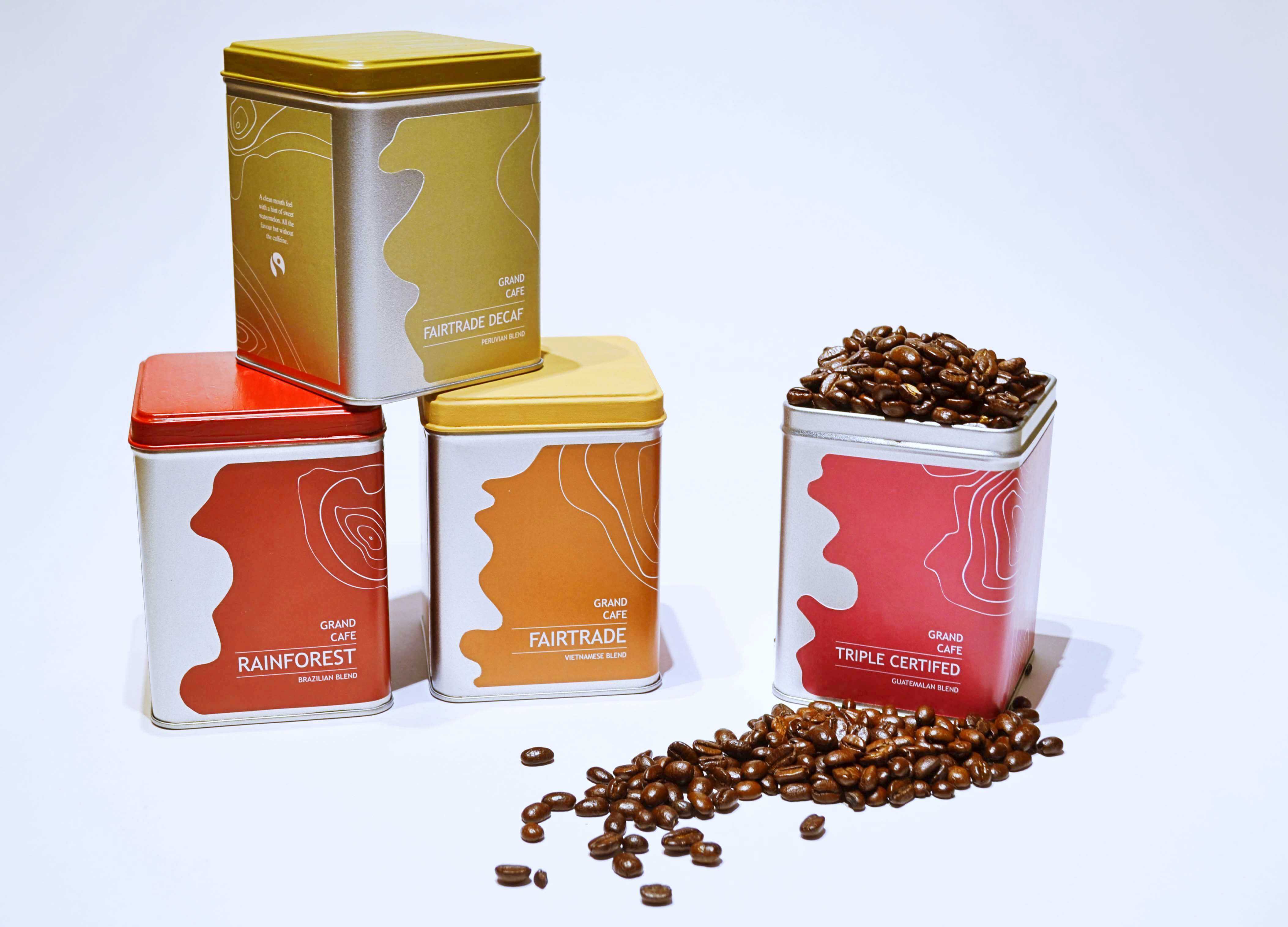
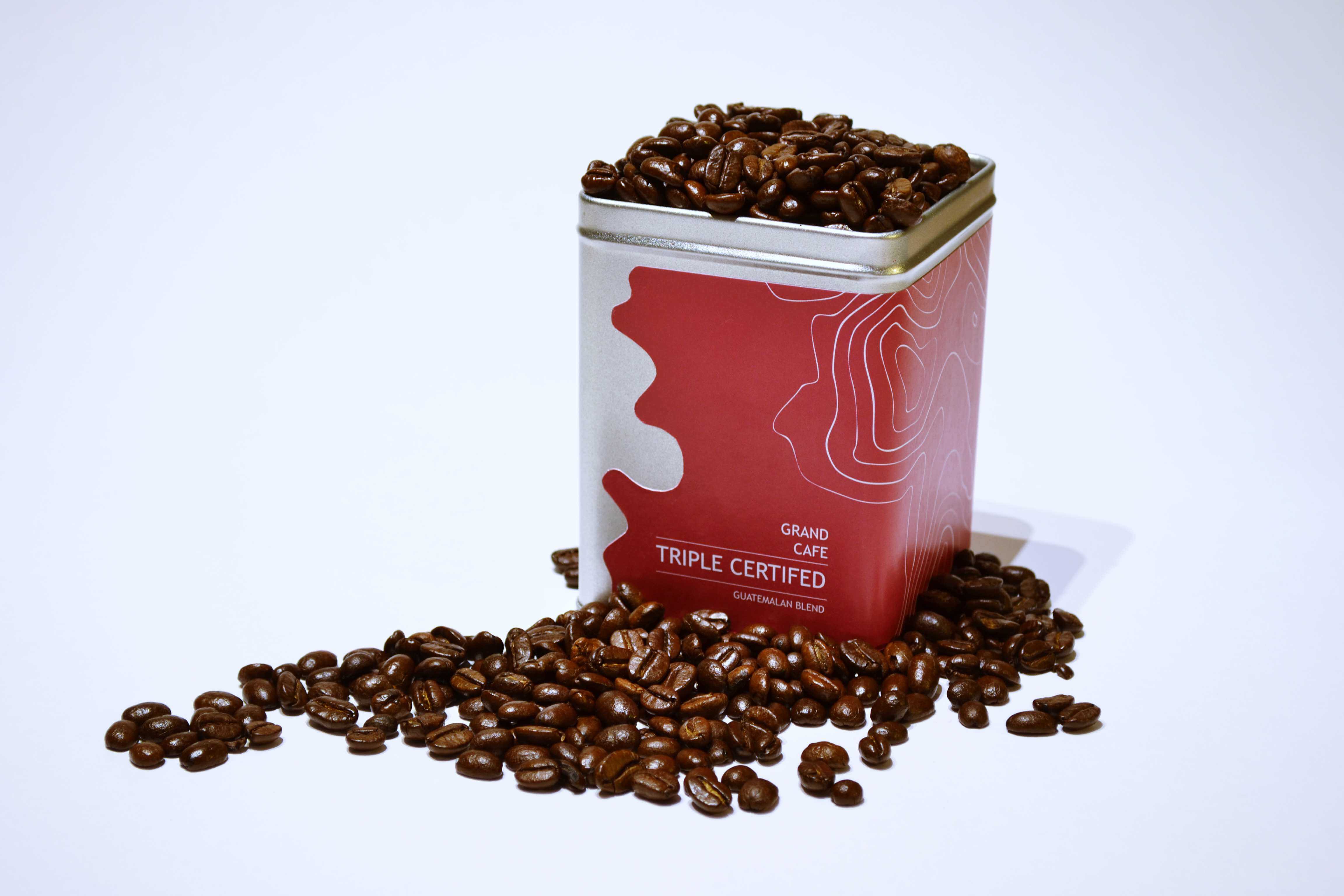
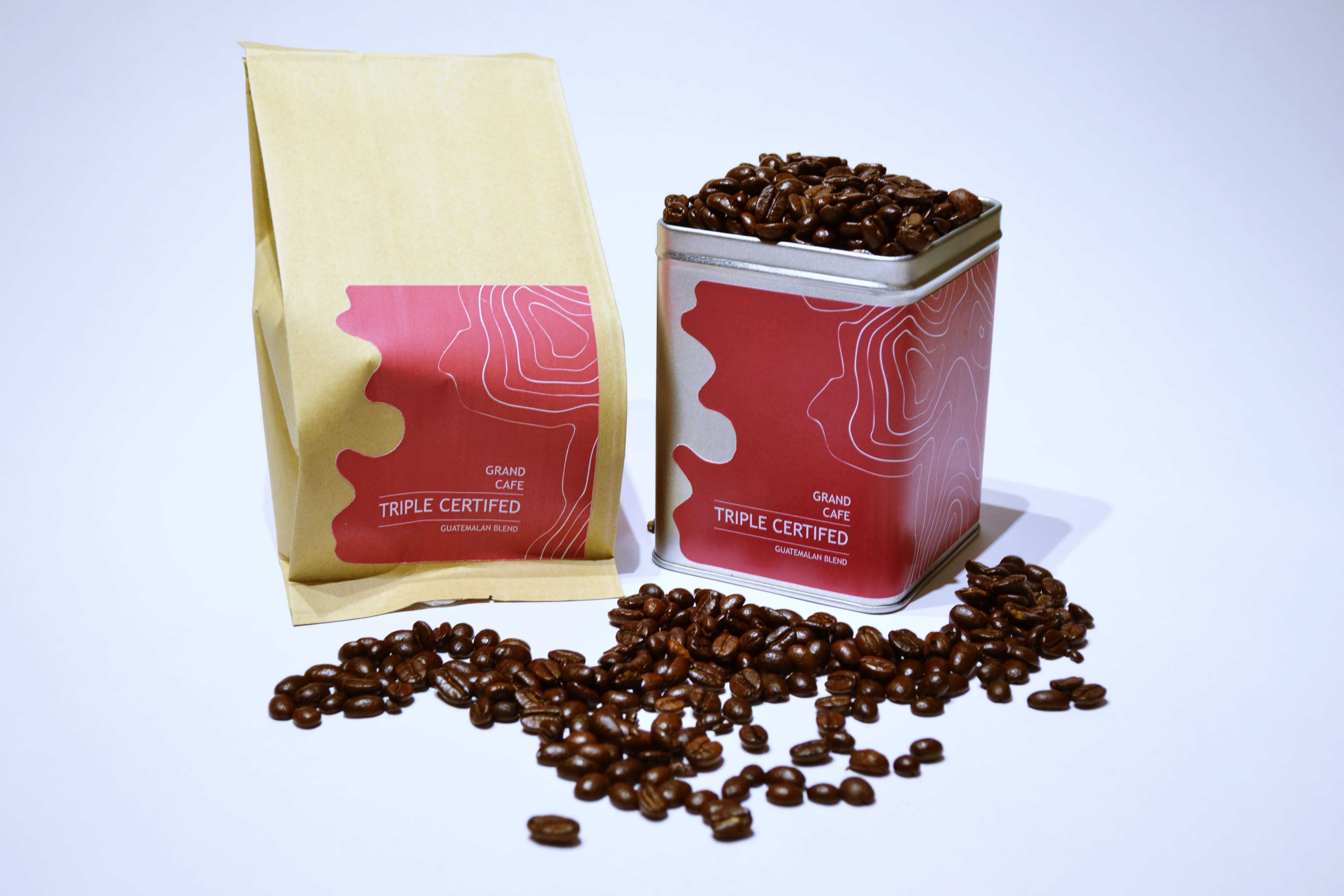
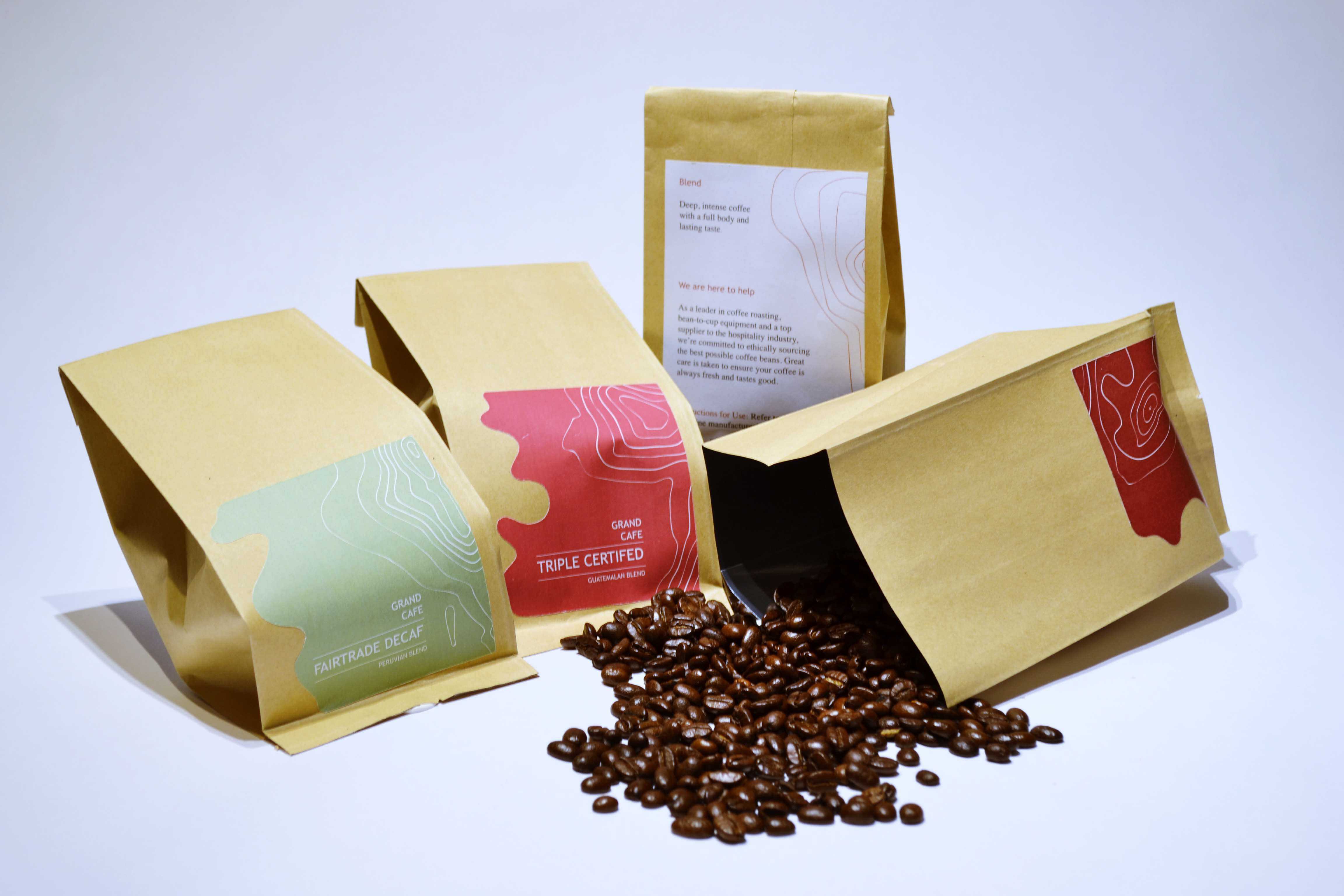
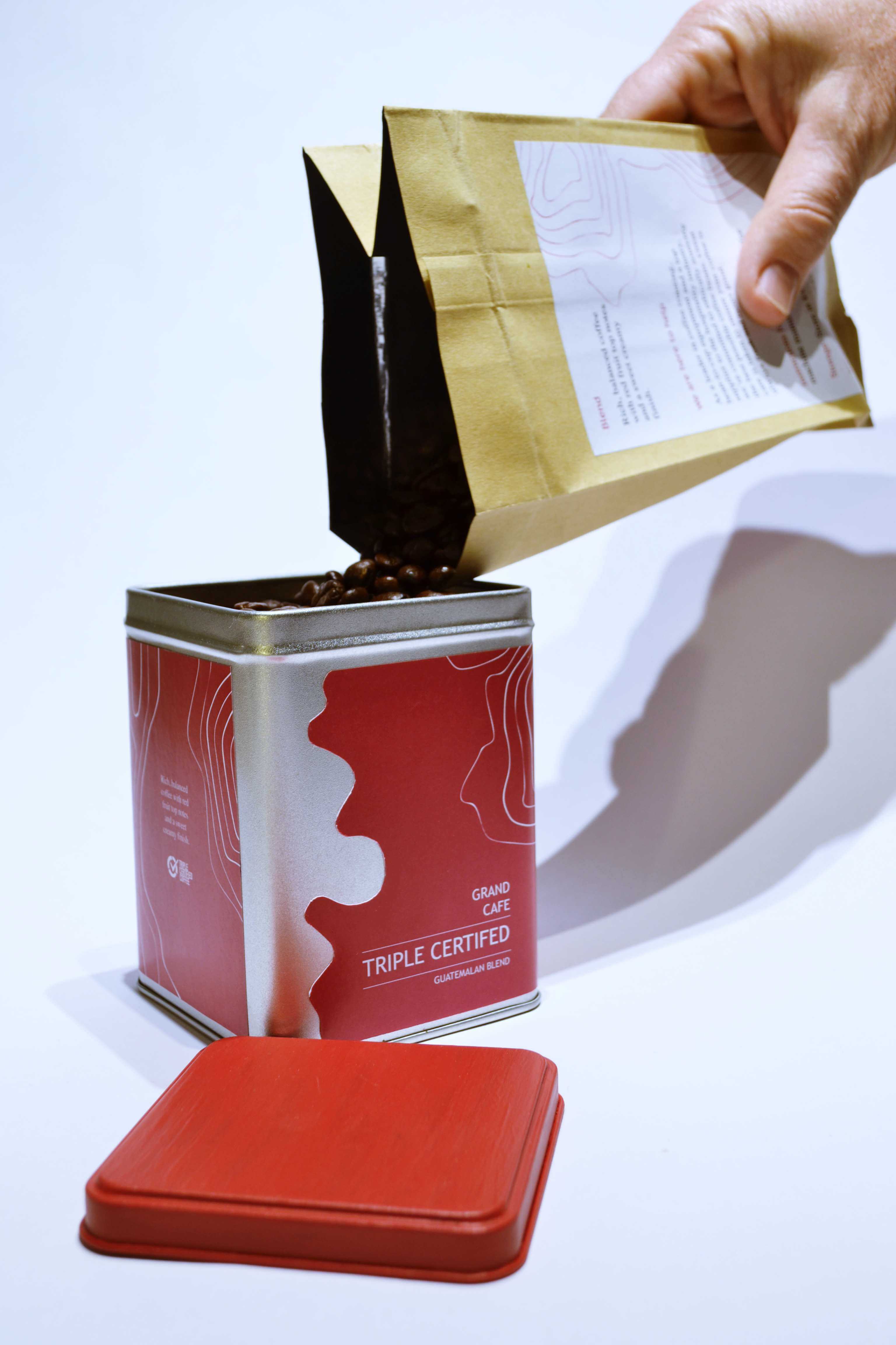
The wavy left edge of the label follow the undulations of the rivers providing the water for the coffee farms/plantations. As well as the rivers also featured on the labels are the contour maps of mountain ranges near the coffee farms. This aims to emphasise the support Grand Cafe provides for the coffee farmers and their families. Furthermore, The final chosen colour scheme reflects the various stages of a coffee beans life cycle.
