Samaritans
Campaign
Brief:
to design a direct mail piece to highlight the issue of hearing loss and encourage young people to consider hearing protection.
Solution:
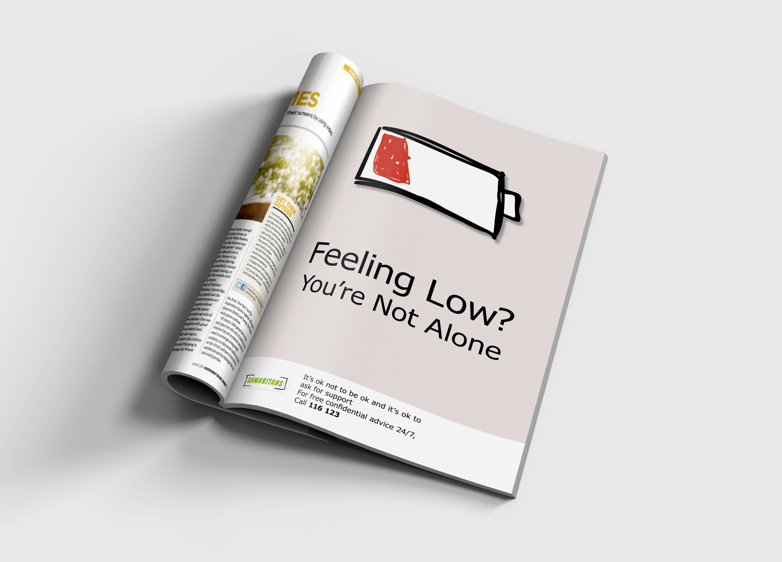
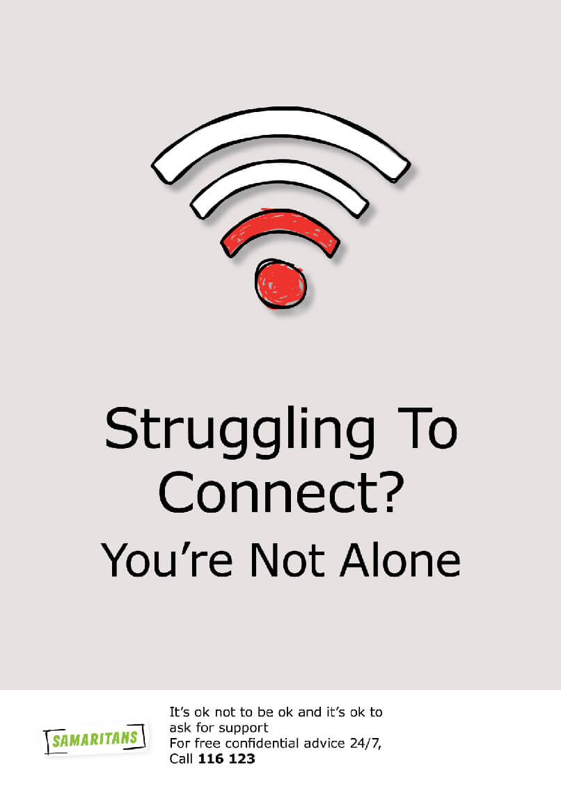
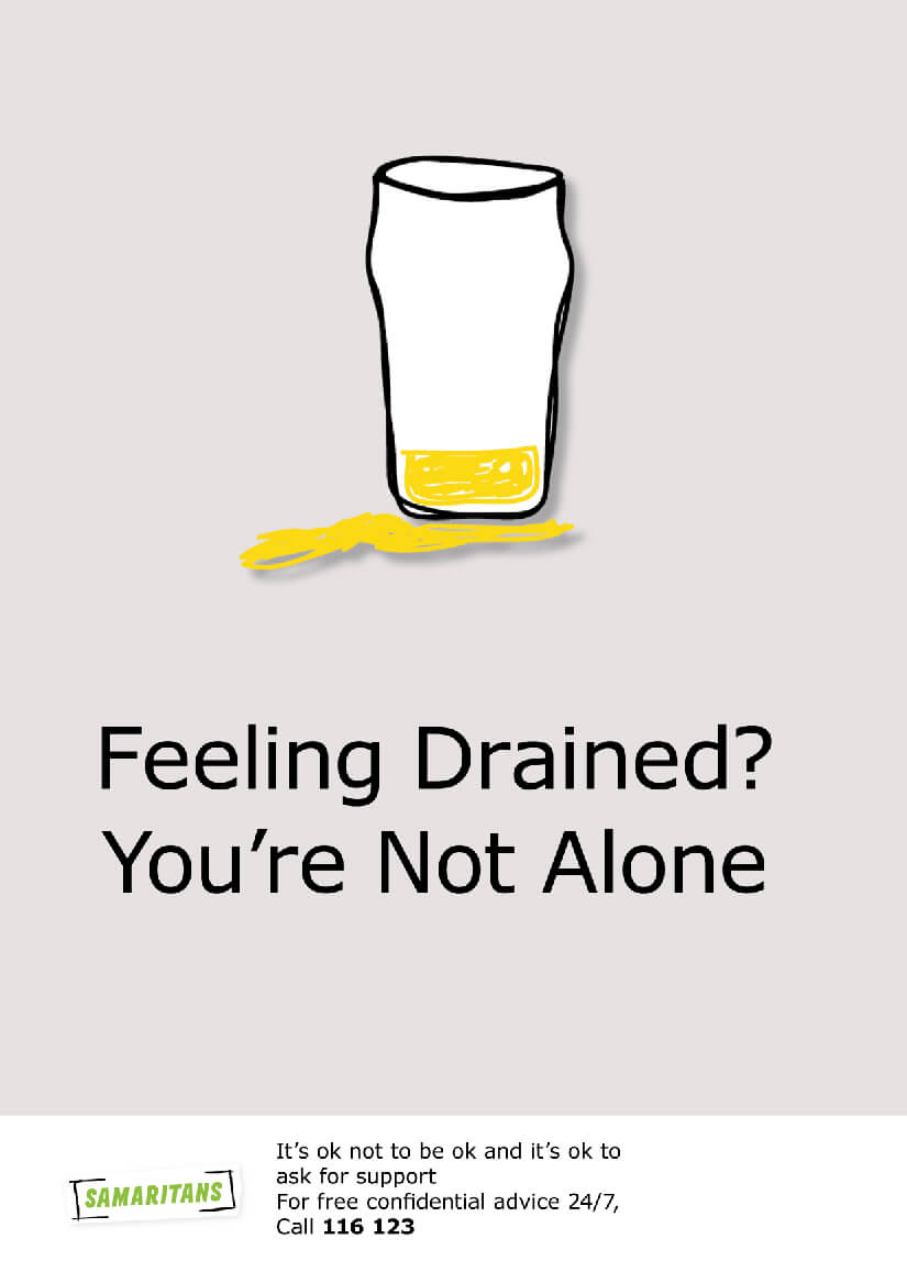
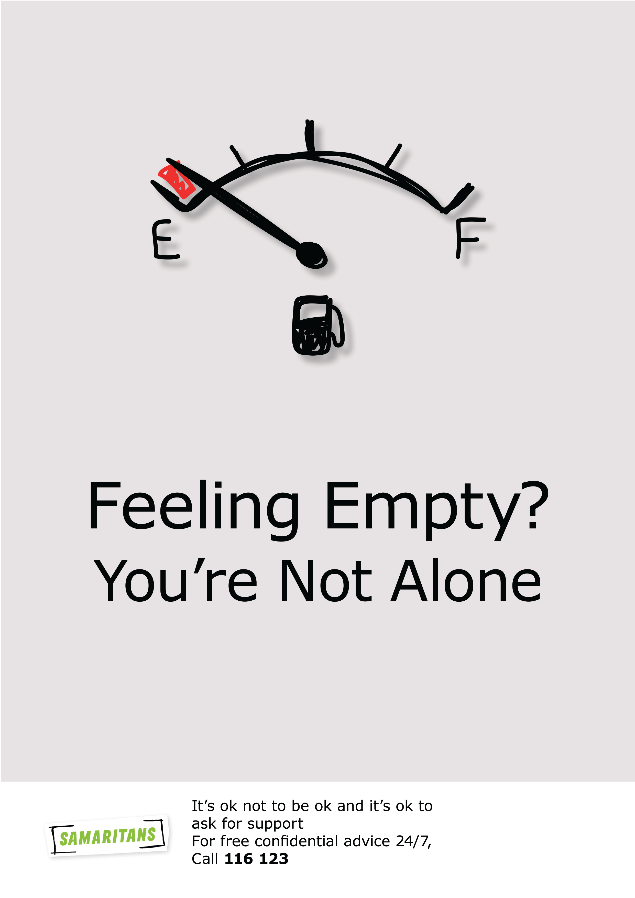
I chose to follow the slight hand-drawn effect on the current Samaritans logo. I found this kept the style continuous and constant throughout the campaign style. The use of the pint glass, Wi-Fi icon, battery image and fuel gauge aims to relate to male interests. It also provides a more sensitive and light-hearted approach to suicide prevention, relating everyday day problems with gradual solutions to the idea of suicide.


